

Two Quirky Birds
Logo Development & Branding
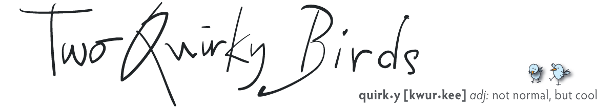
To develop a logo and brand identity for this fledging directory styled information website about all that is cool about Sydney. Run by ‘Two Quirky Birds’ the brief was to create something that was wholly original and… quirky!
Client: Two Quirky Birds
Job: Brand identity
The Process
The client favoured the use of a handwritten font for the logo, however all the samples from the hundreds, if not thousands of handwritten fonts available just didn’t scream the right levels of quirkiness! So, looking further afield for inspiration… who better than Quentin Blake, illustrator to Roald Dahl and author in his own right?
WCD created a font in the style of Quentin Blake, allowing Two Quirky Birds to use something totally original, whilst creating a visually striking logo on which to build the brand identity.
Further development of the font created a full alphabet and the setting up of font files so the business could apply their own unique font in many ways.